A rebrand brewed for success
Market Research, Branding, Packaging, Print, Responsive Design, eCommerce
Visit WebsiteWisconsin has a long brewing history that goes back almost two hundred years. Today, the state ranks ninth in the nation for microbreweries per capita. Since 2004, Rush River Brewing of River Falls, Wis., has produced crafted ales enjoyed throughout Wisconsin and Minnesota.
In the past, Rush River had been pitched by different agencies on grand marketing campaigns that felt more like portfolio-builders for the agencies than foundational work that would help Rush River.
We took a different approach: instead of coming to Rush River with pre-packaged, inflexible proposals, we explained the benefits of rebranding and listened to the brewery’s potential concerns with the process. Over the course of several meetings, we grew to better understand the company, the strength of its products, and where it saw itself in the marketplace. Our approach showed Rush River that we were invested in the company’s success and built the foundation of a trusting, collaborative relationship.
Rush River’s existing brand wasn’t engaging; it didn’t tell a story, nor did it connect with potential customers. Poor shelf presence made it difficult for Rush River to get wider distribution, and sales figures confirmed the problem: sales of its branded, bottled beer had peaked at one-third, while keg sales were strong and growing.
Compared to its competition, Rush River’s packaging lacked sophistication and failed to convey the quality of the product.
We started the project by thoroughly researching the national and regional beer markets and discovered that Wisconsin is full of breweries with water-themed names – lots of “creeks,” “shores,” “rivers” and “falls.” A quick image search for Rush River revealed other companies with similar names or logos, none of which were the level of quality that we envisioned for the new Rush River brand.
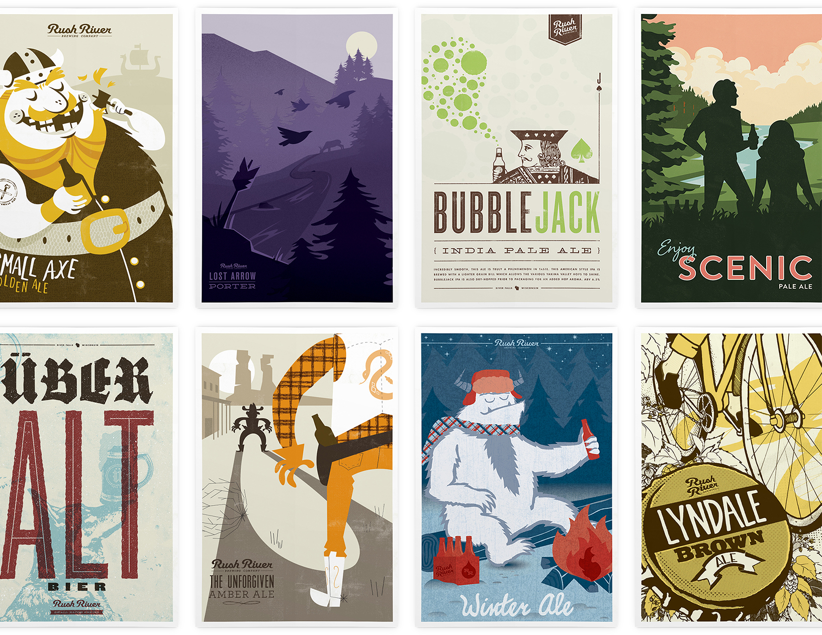
Rush River saw its product as the “working man’s craft beer.” Using this concept and information from our competitive analysis, we identified a handful of different directions in which we could take the brand. We developed mood boards that reflected each style and included colors, patterns, font families, illustrations, icons and more.
Branding
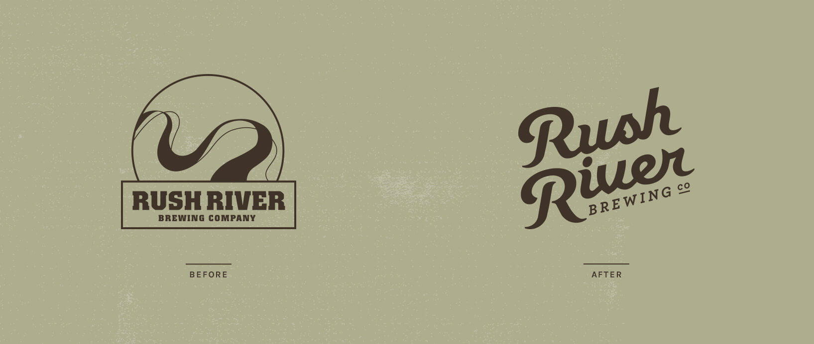
Rush River’s original logo was an abstract river with blocky type which made the logo feel dated and a bit like a construction company. Through our discovery process we determined that we wanted to avoid the obvious depiction of a river which is everywhere on beer labels. We resolved this issue by creating a custom, fluid script that subtly conveys the concept of “river” and sets the tone for a modern yet classic looking brand.
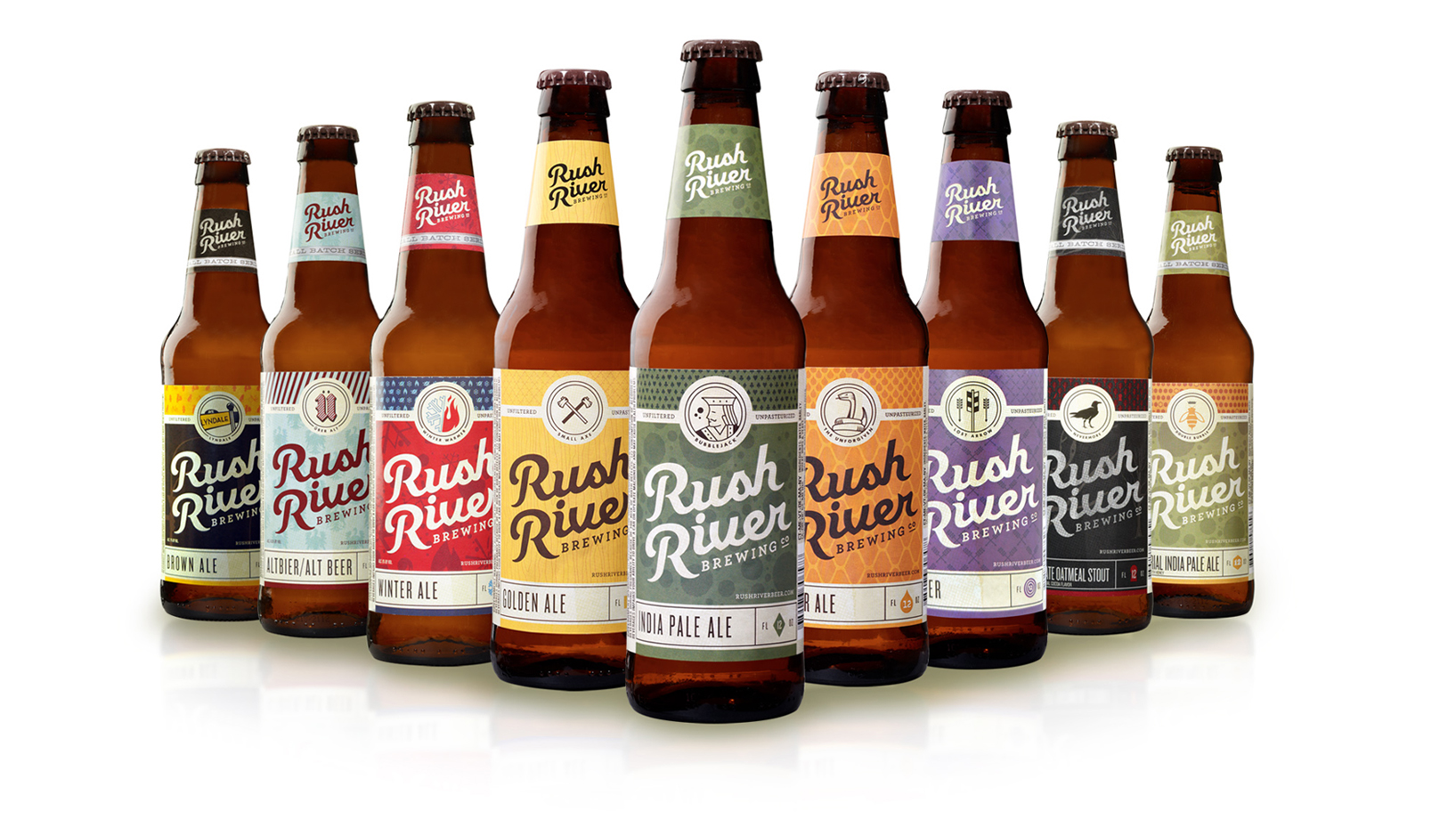
Knowing that the logo needed to be part of a flexible system that would be applied to a ton of different applications, we created both horizontal and vertical formats. In addition, we produced a design system to handle the growing number of flavors. This system includes a flavor icon, type treatment, color palette and flavor pattern.
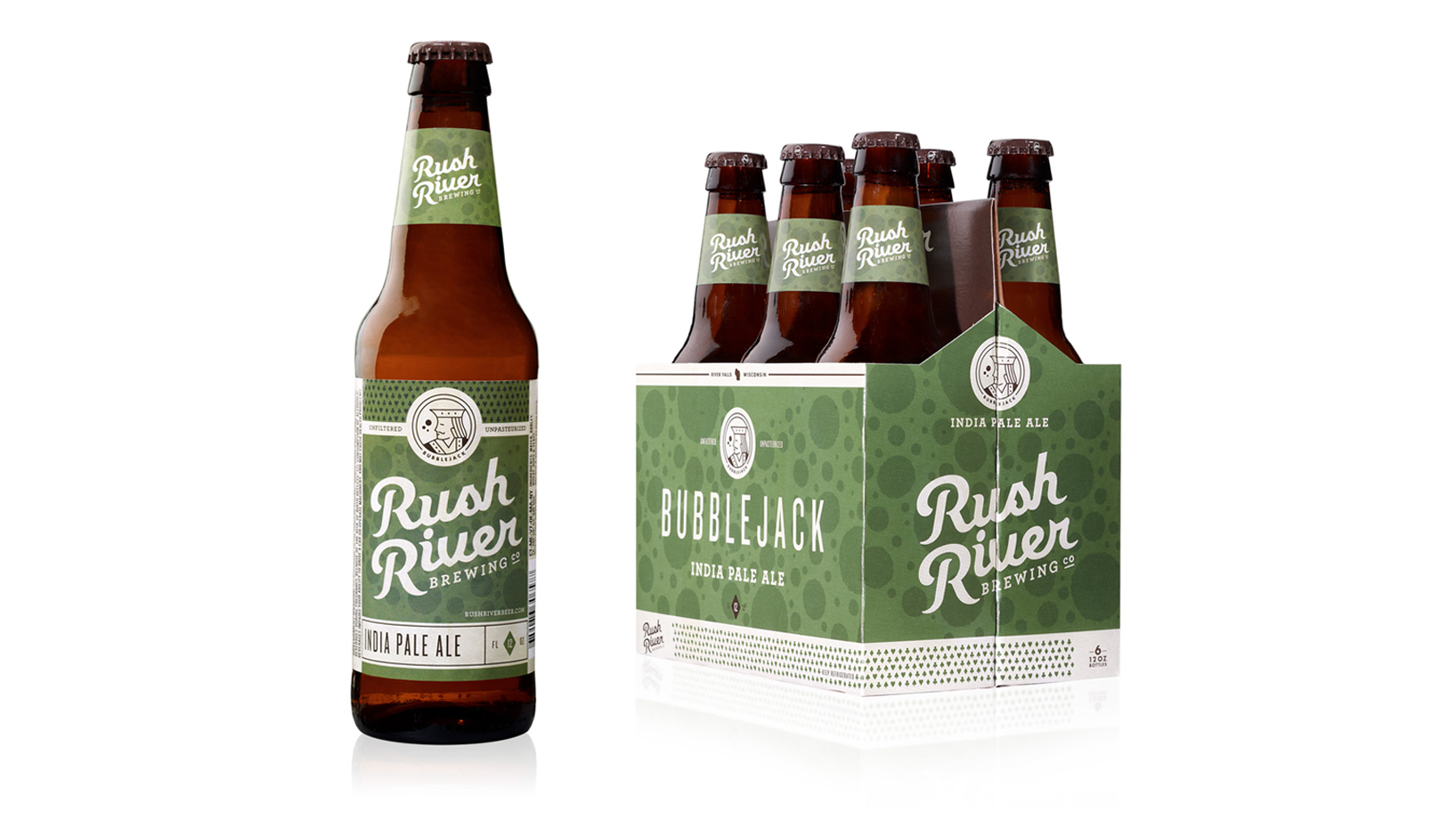
Upon completion of the logo, we set out to define the visual aspect of the brand through the use of color, pattern, custom typography and iconography. A system was developed for each flavor, with choices reinforcing the story behind the name.
We were also asked to create packaging for seasonal “mixers”, giving us the opportunity to construct an entirely new shelf presence. Designed using two plaid themes – a picnic plaid for summer and a cozy wool plaid for winter – we wanted the packaging to be eye-catching on shelf, while maintaining the overall feel of the brand. They proved to be an instant hit, selling out within weeks of production.
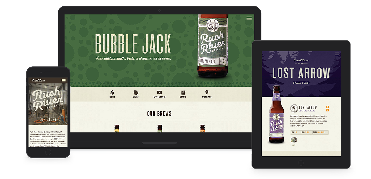
We’ve also recently redesigned and rebuilt the Rush River website from the ground up. The new website features larger imagery, an eCommerce shop built on WooCommerce, a few branded videos and a vendor portal.
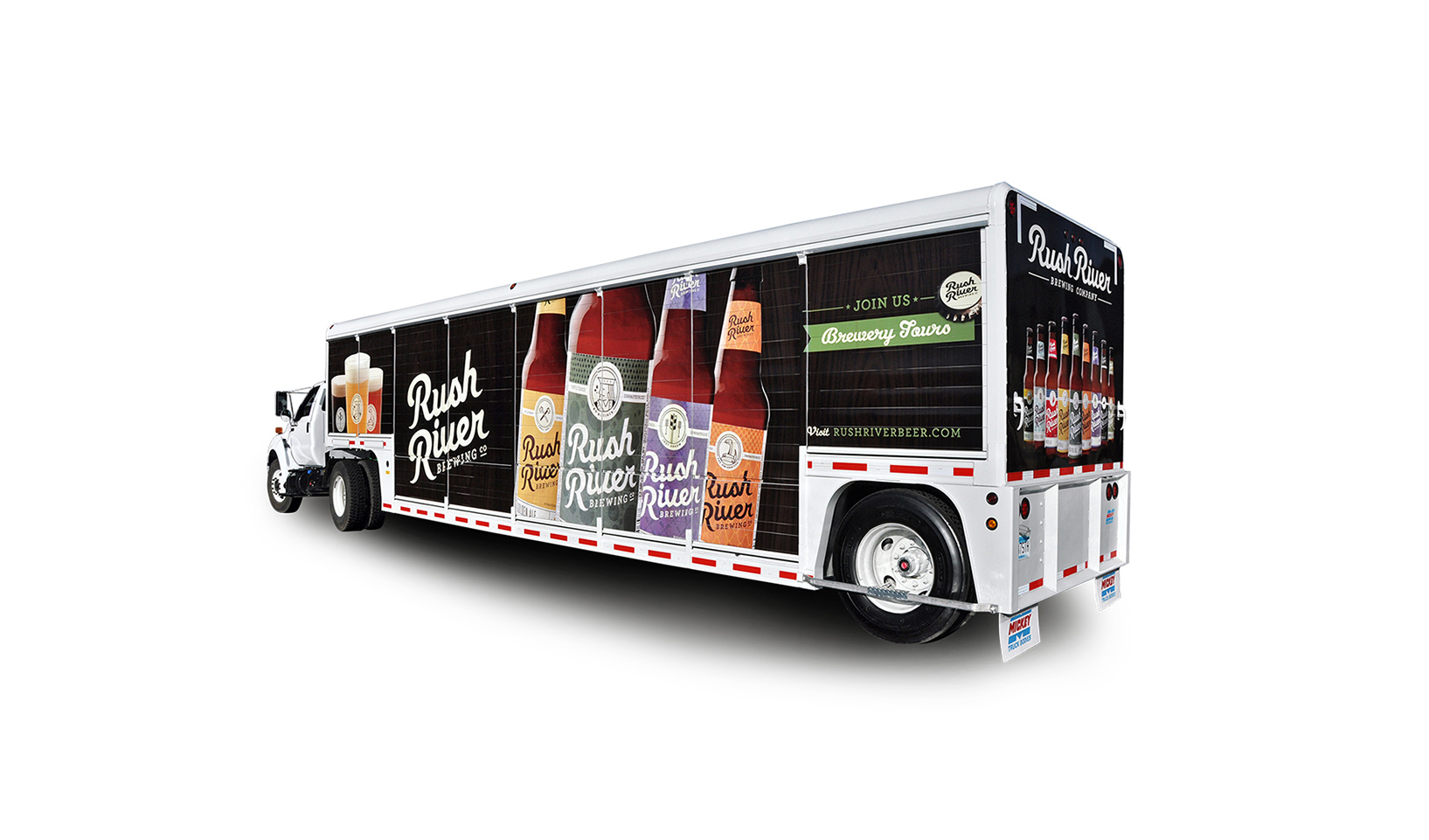
Our solution for Rush River Brewing was a full-scale rebrand of their company. We made sure to look at every consumer touchpoint and build consistency throughout.
A list of deliverables includes: corporate branding, package design, product flavor identification system, tap handles, website, posters, collateral, truck graphics, video, and ads.
By every measure, Rush River’s rebranding was exactly what the company needed. The new identity speaks to the quality and craft of the product and appeals to a wide demographic. Finally, the new brand is extensible, allowing the growing brewery to create new products in the future.
Rush River now stands above its competition in the crowded microbrewing industry, and is no longer River Falls’ best kept secret.

- AIGA Design Show 2012
- Creativity International Awards 2012: Silver
- GD USA Web Winner 2013
Bottle Sales

Keg to Bottle Sales Ratio

Brewing Capacity